
iTunes has all kinds of metrics in it’s library database. I’ve always wanted to see some detailed breakdown on various things, like how many songs from different decades I have, how many different genres I have, etc. In addition to those basic things, there are a lot more metrics that make analysis very interesting.
I’ve written Perl scripts that read from iTunes library in the past. This was mainly to allow syncing to SD cards. I didn’t really want to write something to do the analysis if there was something already available. A quick search led to “The Super Archiver” by Nosleep Software (http://www.nosleepsoftware.net). It’s a Java application, but works very fast and produces more output than I imagined possible.
After starting, click the “Analyze” button, it’s the only one and right in the middle of the window. Analysis took less than 10 second for my library which contains about 7100 items. It produces a summary screen right away with some interesting figures! Here is the summary window:

But WAIT, theres MORE!
Along the bottom of the window are different icons. Clicking each one gives a different view into the analysis. The folder icon (Genre’s) produces a breakdown of how many songs in each genre with a graph that looks like this:
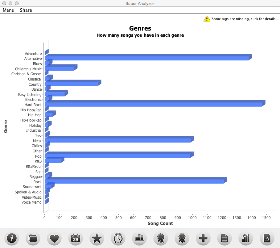
Yeah, there is Childrens music since I manage a childs iPad from the same library. However I reset the play counts to 0 after every sync for that music. And it appears that it is correct as I would have told you my preferred genre is Hard Rock.
Clicking the calendar icon (Release Year) produces a graph that shows how many songs in each decade you own vs plays in each decade. For any window that has a “Show ALL” dropdown, you can refine the result by choosing a single decade. Here is a sample:

Clicking the clock icon (Listening Times) produces a graph showing the listening time at various points in the day. Sample:

The graph icon (Song Quality) isn’t that impressive and is easily discerned from looking at your music library directly if you have the bitrate column displayed, but none-the-less its cool to see:

The first award ribbon icon (left – Most Played) produces a dual graph display showing Most Played Artists and Most Played Albums. This was interested as I would have said Dokken was my favorite band, maybe so but it doesn’t reflect in the play count*. But it was dead on as showing “Standing Hampton” as my favorite album. Truly a great album! Graphs:

The second award ribbon icon (right – Most Played) produces another dual graph display showing Most Played Decade and Most Played Genre. Yep, I’m a product of the 80’s hair metal (arena rock, or whatever you want to call it) era. Graph:

Clicking the plus icon (Play count) produces a graph showing the number of songs by play count. Looks like a large portion has play count of less than 5. I’m not mixing it up enough apparently. Graph:

Clicking the graph icon with an upward arrow (Library Growth) produces a graph showing when you added songs from different decades by year:

Clicking the document icon (Song Words) produces a graph showing the most common words appearing in song names. Graph:

Very cool information, and a lot more than I was looking for. With all that said the output is only as good as the library meta data. I’ve spent a considerable amount of time over the past 5 years getting the meta data accurate in my library so I feel this is fairly accurate. Well, at least as long as I’ve been listening to music solely digitally. The analysis doesn’t reflect all the listen counts from before the library was digitized, so all those times I listened to “For Those About To Rock” in the Eighties, or on cassette in a car or Walkman, etc, are not counted.
But still, very interesting!


